![Why is the Bugatti emblem called “Macaron”? [Car Emblem Secrets 14: Bugatti]](https://wheelfeed.com/wp-content/uploads/2025/07/1421-1761184046261.jpg)
What does the Bugatti emblem symbolize?

The emblem of the “Type 35” that appeared in 1924. This model was developed as a racing vehicle.
The Bugatti emblem consists of the white lettering “BUGATTI” on a red oval background, 60 small red dots, and “EB” at the top, the initials of founder Ettore Bugatti. This design has remained almost unchanged since the company was founded in 1909. The red symbolizes passion and power, the white symbolizes purity, and the sharp outlines symbolize precision. The typeface in the center is original to Bugatti, and represents the individuality of the brand and the pride of its craftsmen.
What is the hidden meaning behind the 60 red dots?
The Chiron, which was released in 2016, also features an emblem with basically the same design as before.
There is no official explanation for the 60 red dots that decorate the perimeter, but one theory is that they represent rivets used in industrial products. It is also said that the design is nicknamed “macaron” because of its visual resemblance to French pastries. The design also has the effect of increasing visibility, clearly asserting the brand’s presence even when viewed from a distance.
“Macaron” inherited from previous models

[1]

[2]
[3]
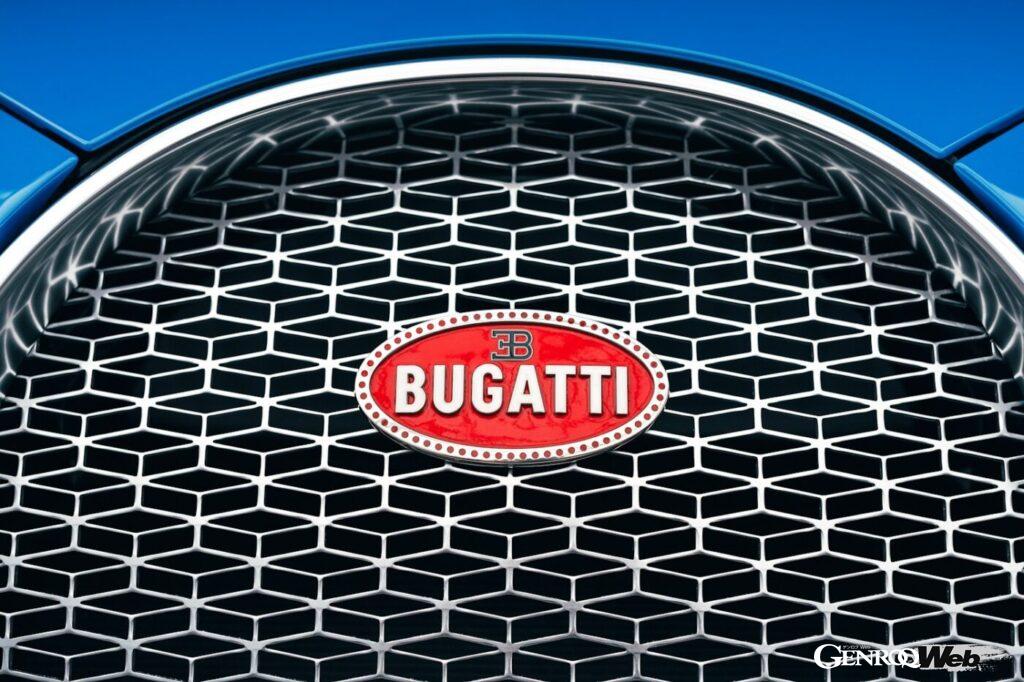
[1] A sketch of a “macaron.” [2] The emblem that symbolizes Bugatti’s presence, luxury, design, and outstanding craftsmanship. [3] A mold for embossing.
This Bugatti emblem remained unchanged even during the brand’s dormant period, and even after its revival under the Volkswagen Group in 1998, it has been passed down to hypercars such as the Veyron and Chiron. The macaron still has a bold presence on the front grille of the new generation model Tourbillon, which was released in 2024. The unchanged design shows that Bugatti not only adopts the latest and greatest technology, but also carries on tradition and artistry.
High-quality materials and craftsmanship: jewelry-quality

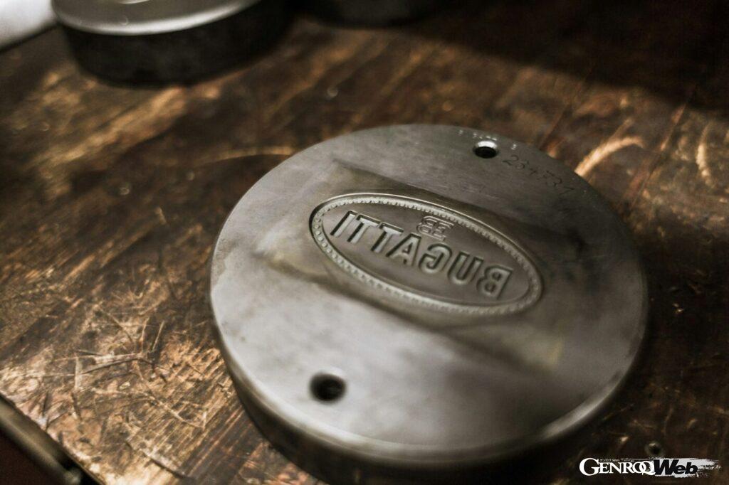
[4]

[5]
[4] The Bugatti emblem is only permitted to be produced by the long-established German company Poellath. The photo shows the embossing process. [5] From the application of enamel to firing, polishing, and final inspection, it takes dozens of hours to complete the process by hand, and it is truly treated as a work of art.
The Bugatti emblem stands out from ordinary brand logos. Made from sterling silver, the same material used for jewelry and high-end tableware, it is embossed in a traditional way, then hand-enameled and polished to a mirror finish by artisans. Its texture and shine make it worthy of being called jewelry. It is extremely rare to see such expensive materials and elaborate manufacturing techniques used in the emblem of a mass-produced model. This fusion of functional beauty and aesthetic beauty is what truly defines Bugatti.
Bugatti’s Macaroni explains the philosophy of the “art of driving”
Bugatti’s philosophy has remained unchanged for over a century (pictured is the Veyron, which was released in 2005).
Bugatti’s macaron is not just a brand logo, but a symbol of craftsmanship and artistry that has been passed down for over a century. Crafted by hand with meticulous attention to detail, the emblem embodies the company’s philosophy of never compromising, not only in design but also in the selection of materials and assembly process. It is also proof that Bugatti is not just a “means of transportation,” but a “work of art.” The macaron can be said to be the face of “moving art,” encapsulating that spirit.
Bugatti prides itself on its unchanging nature

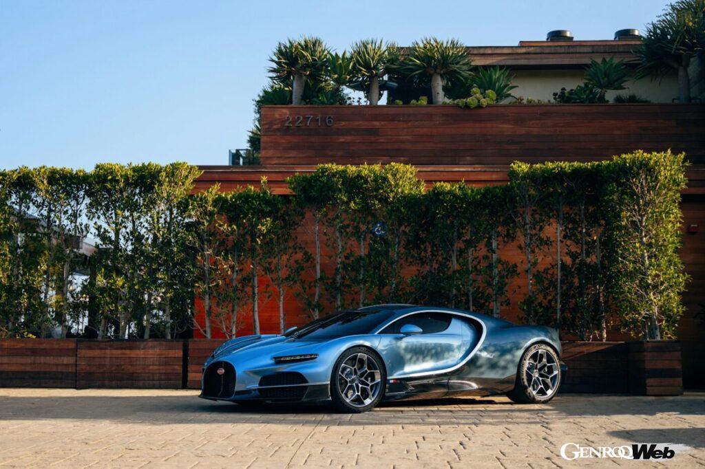


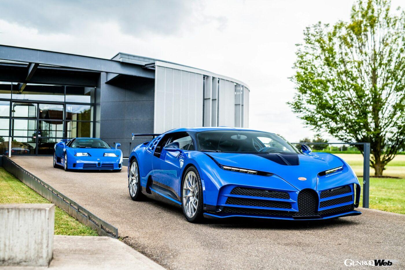
The latest model, the Tourbillon, released last year, also features the traditional macaron on its horseshoe-shaped front grille.
The Macaron embodies Bugatti’s brand philosophy of never losing sight of its roots while embracing cutting-edge technological innovation. While the car’s performance has improved with each new model, the emblem has remained largely unchanged.
This shows that each car is not just a symbol of speed or wealth, but also a successor to tradition and spirituality. This macaron will surely be adorning the front of a Bugatti in the same shape even 100 years from now.