![“Why did Peugeot choose the lion?” The meaning and evolution of the emblem [Car Emblem Secrets 08: Peugeot]](https://wheelfeed.com/wp-content/uploads/2025/04/1907-1761191099462.jpg)
Peugeot began as a steelworks

Armand Peugeot laid the foundation for Peugeot as an automobile manufacturer.
Peugeot’s origins date back to a family-run ironworks in eastern France near the Swiss border. The Peugeot brothers, Jean-Pierre and Jean-Frédéric, founded the company Peugeot Frères in 1810. At the time, they manufactured iron products such as springs, coffee mills, and sewing machines.
The company took its first steps as an automobile manufacturer in 1889. Jean-Frédéric’s grandson, Armand, who was a bicycle manufacturer, unveiled a three-wheeled steam car at the Paris World’s Fair. Later, the company developed its first four-wheeled vehicle, the Type 2 Quadricycle, equipped with a Daimler gasoline engine. In 1896, Peugeot Automobiles (Societe Anonyme Des Automobiles Peugeot) was founded.
Why a Lion? The Hidden Meaning Behind the Emblem
[1]
[2]
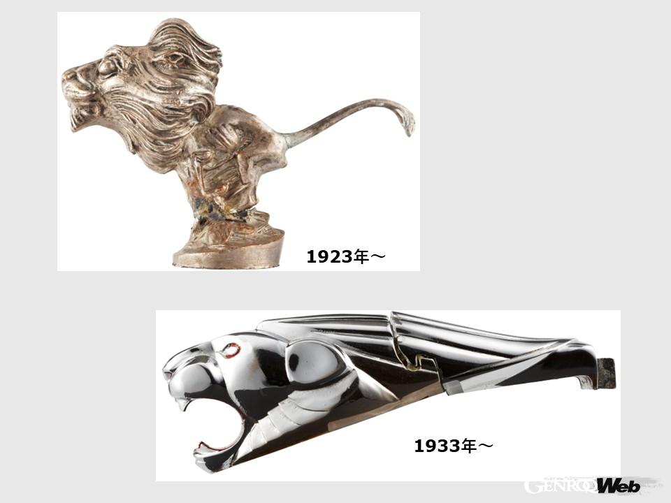
[1] The lion emblem was first used on a Peugeot car. [2] The mascot on the tip of the hood also features a lion motif.
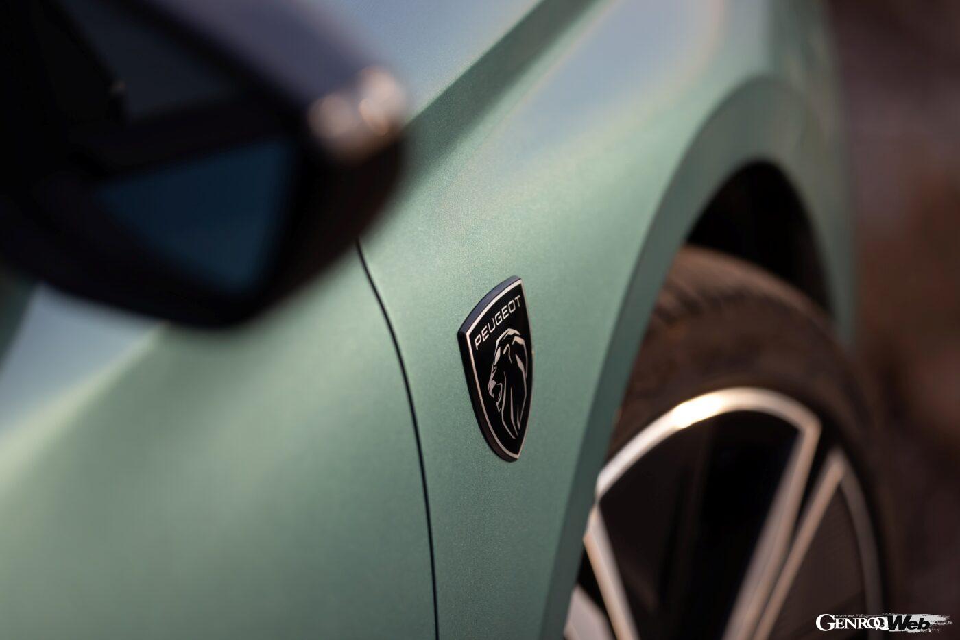
Peugeot’s trademark is the lion, a tradition dating back to the days of the steelworks. In the Franche-Comté region, where the company’s birthplace, the town of Elimoncourt, is located, the lion was depicted on the coat of arms as a symbol of bravery. It is said that Peugeot Brothers used the lion as its emblem to express their commitment to the strength and high quality of their products.
In 1905, the first emblem to be adorned on a Peugeot car was designed. The design of a lion walking on an arrow was used not only on cars but also on motorcycles, tools, and other products. In 1923, sculptor René Baudition designed a lion mascot, which was attached to the tip of the hood. Ten years later, this mascot evolved into a more sophisticated design that emphasized the lion’s head.
Evolution of the Peugeot emblem

[3]

[4]

[5]
[3] The new emblem, which appeared after the war, was based on the regional coat of arms. [4] It was modeled after the flag of the Franche-Comté region. [5] The design has since evolved with the times.
In 1948, the Peugeot 203, the first model after the Second World War, was released. A new emblem was introduced, recreating the lioness on the coat of arms of the Franche-Comté region. In 1958, the lion head mascot on the bonnet was phased out due to safety concerns.
The emblem was subsequently modified, with the frame changed to a shield, a lion profile with its mane blowing in the wind, and the frame removed altogether. In 1975, it evolved into the “Lion Outline,” which featured only the outline of the lion. At this time, an energetic lion stood on its hind legs and stretched its front legs out in front of it.
In 1998, the ionic outline with its emphasized lines was changed to a more substantial chrome finish. In 2010, it was replaced by a more dynamic lion with contrasting two metallic finishes, one matte and one glossy. The Peugeot emblem has undergone relatively frequent design changes throughout its history, but the upright lion adorned the front grille for nearly 50 years.
The Shield and Lion Revisited in Modern Times
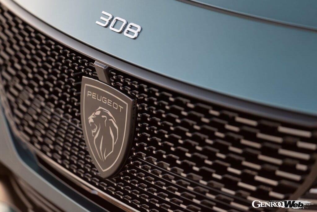
The new lion has been released along with the renewal of the Peugeot 308.
The emblem also underwent a full model change when the new 308 was launched in the European market in 2021. The 308, which was introduced as a model that combines cutting-edge technology with styling that advances Peugeot’s new design language, is a model that “embodies the new Peugeot.” The redesign of the iconic emblem is said to “express an identity that is timeless, universal, and adaptable to diverse cultures.”
Regarding the return of the lion’s profile design, the company explained, “It was inspired by the emblem from the 1960s and reinterpreted to express a powerful modernity.” The lion’s head and the PEUGEOT lettering on a shield-shaped frame have been featured for the first time since the 404 was released in 1960. The design can be said to combine the history of France’s oldest automobile manufacturer with modern values. The Peugeot emblem symbolizes the strength and high quality required in each era.
PHOTO/STELLANTIS