The origins of the company that the name “Volkswagen” indicates

The “people’s car” was actually produced in 1945, after the end of World War II.
Volkswagen is an automobile manufacturer founded in 1937 under the “People’s Car” concept, which was initiated by the German government at the time. This plan was promoted under Adolf Hitler, and Dr. Ferdinand Porsche was in charge of development. The emblem is a simple combination of the initials Volk (people) and Wagen (car), and is designed to be easily recognizable to anyone.
A production plant was also built in Wolfsburg in 1938, but the outbreak of World War II prevented mass production of civilian vehicles and the plant was converted to military use. After the war, Volkswagen resumed operations under British control in 1945. Production of passenger cars began, and the success of the Beetle led to Volkswagen’s growth into a global brand.
The fact that Volkswagen’s starting point was closely linked to the political system and national projects of the time is a major feature that sets it apart from other car manufacturers.
The era of the original emblem
[1]

[2]

[3]

[4]
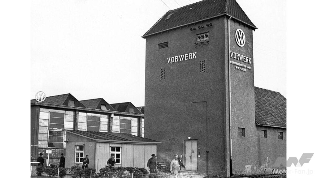
[1] The familiar “VW” mark can be seen at the factory built in 1950. [2] A similar emblem was also attached to the commercial vehicle “Transporter” that appeared in 1951. [3] The first generation “Golf” was born in 1974. The VW emblem is simple and flat, which is impressive. [4] The emblem of the current model.
The brand’s relationship with politics was also strongly reflected in the emblem design from the brand’s early days. Volkswagen’s first emblem featured a monogram combining the initials “V” and “W” at the center, with gear designs placed around it. Furthermore, it is known that the outer part of the emblem contained elements similar to the “swastika” design used under the Nazi regime.
This graphic disappeared within a few years, and the Volkswagen emblem was changed to a design of two letters surrounded by gears. Since then, the emblem has been updated to suit the changing times, with changes in line thickness, color scheme, and adoption of three-dimensional expression. Although the gear design is gone, the simple basic composition of two letters surrounded by a circle has been maintained from the company’s founding to the present day.
It can be said that this reflects Volkswagen’s philosophy of adapting to changes in the social environment while maintaining the simple and clear essence of the brand, which is “the people’s car” as symbolized by the V and W.
2019 Brand Refresh
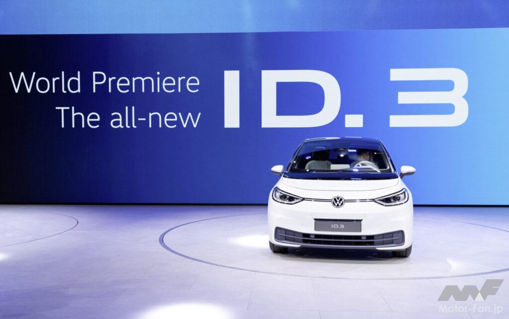
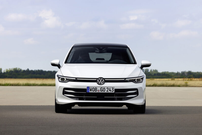
The current emblem was introduced in 2019 along with the first mass-produced BEV, the ID.3.
In 2019, Volkswagen unveiled a new logo design. The company said the revamp signified the dawn of a “New Volkswagen” for the digital and electrified era. Around this time, the company began full-scale implementation of its EV strategy, including the start of mass production of the ID.3. The new emblem was not simply a visual change, but was intended to signal a change in direction for the entire company.
The most distinctive feature of the new emblem is its flat design, which eliminates three-dimensional expressions. Volkswagen explains that this is to ensure high visibility in all display environments, including digital screens, smart devices, and in-car displays.
The previous logo, with its chrome tones and shadows, had issues reproducing well in digital media. The new logo has been designed to address these issues and be more flexible in its use. The lines have also been made thinner, emphasizing a lighter impression.
When announcing the new emblem, Volkswagen explained that the brand’s future direction is to “become more human and lively, incorporating the customer’s perspective more than ever before.” It also appears that the intention is to visually show this open attitude.
The future indicated by the emblem
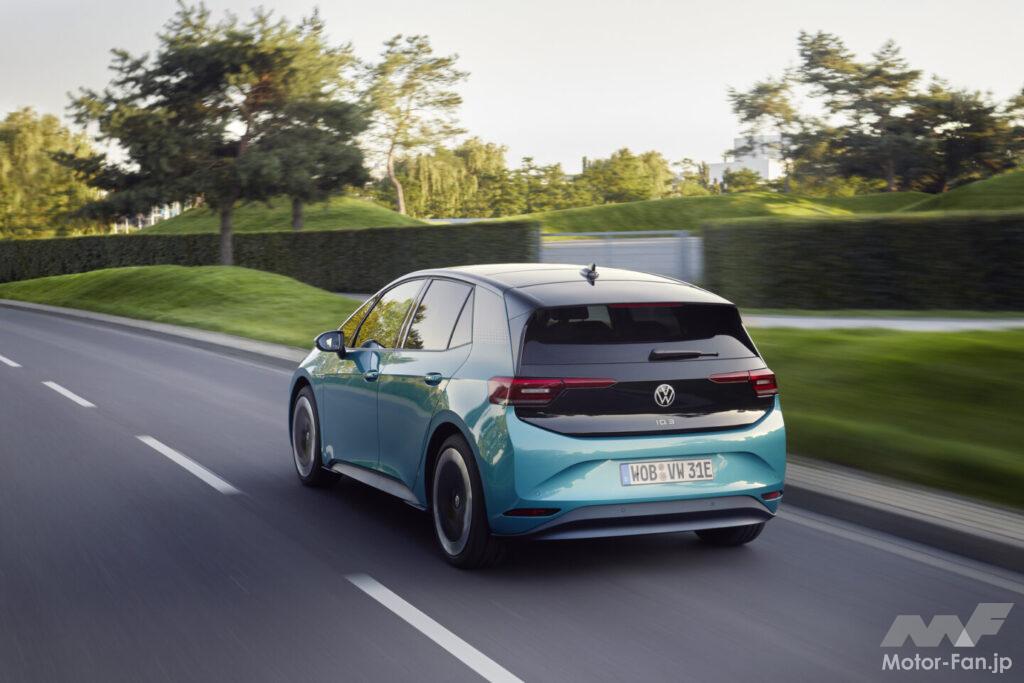
Volkswagen has adapted to the changing times while remaining consistent in its stance of being “the people’s car.”
The current emblem maintains the company’s position as “the people’s car,” while also expressing its evolution from a traditional “robust mass-market car manufacturer” to a next-generation mobility brand.
The Volkswagen emblem is not meant to show off luxury or authority. As the name suggests, it symbolizes the company’s stance of being “a brand that is close to people’s lives.” The latest design is simpler and more modern. However, the essence of the overlapping V and W in the circle remains unchanged. The Volkswagen emblem is proof that the company continues to carry on the idea of ”a car for the people.”

