![The Fiat emblem is a symbol of the Italian national car that has evolved over time [Car Emblem Secrets 13: Fiat]](https://wheelfeed.com/wp-content/uploads/2025/07/1465-1761184706362.jpg)

The early days and Art Nouveau design (1899-1904)

The evolution of the emblem from its founding in 1899 to 1991. It appears to have undergone detailed refinements from the 1920s to the 1930s.
FIAT was founded in Turin, northern Italy, in 1899. Its official name is “Fabbrica Italiana Automobili Torino,” meaning “Italian Automobile Factory in Turin.” The company was founded by Giovanni Agnelli, who manufactured and imported bicycles. In Italy, which was riding the wave of industrialization, he had the ambition to pioneer the future of mobility.
In its early days, Fiat attached a Rococo brass plate to the hood of its vehicles to identify the company (see photo, top left). The emblem, hand-engraved with the company’s full name and including a space for the frame number beginning with N, exudes the artisanal beauty of the late 19th century.
In 1904, in line with the Art Nouveau trend, the first oval logo was introduced. The four letters “FIAT” were placed in the center, and the distinctive “A” curved inward on the right side was born. The design, reminiscent of the sun and olive branches surrounding it, symbolized the fusion of design and the company’s philosophy.
The motorsport era and the laurel wreath logo (1921-1930s)
[1]
[2]
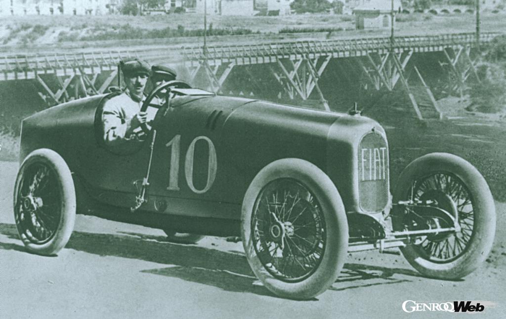
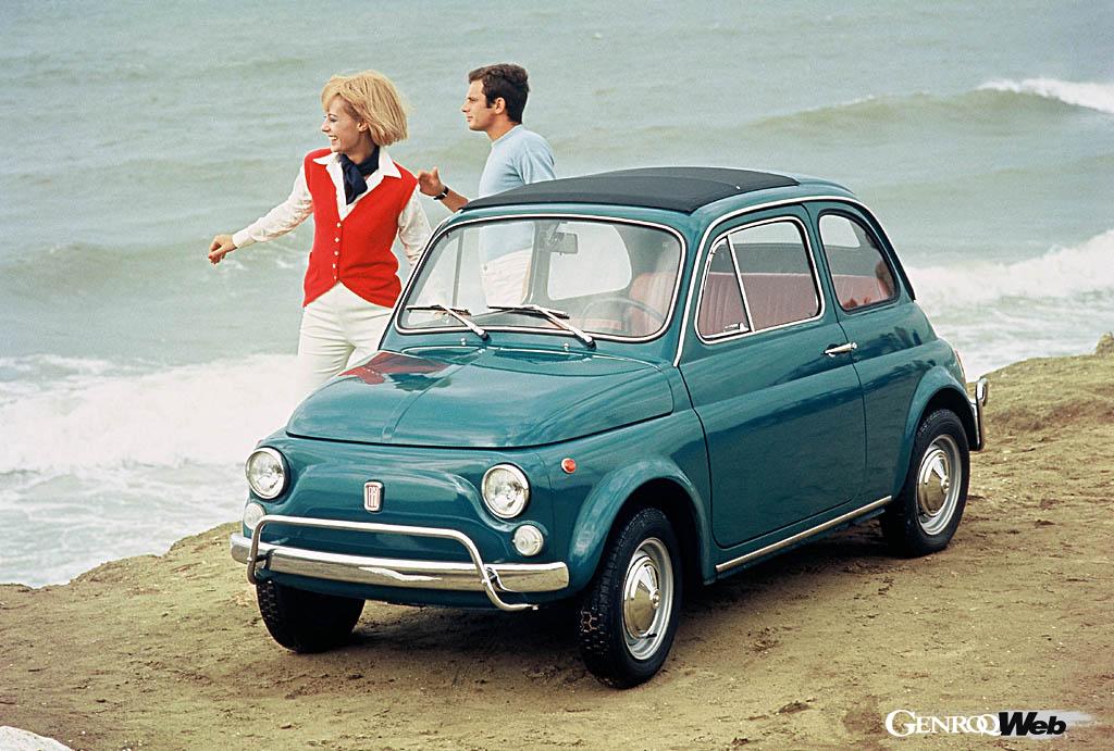
[1] The 801 Corsa, which was active in motorsports (photo is for illustrative purposes only). [2] The bold, vertically elongated red emblem, which was adopted in 1931, can be seen on the front.
With the development of motorsports, a round emblem with improved visibility was created in 1921. The design featured red lettering on a white background surrounded by a laurel wreath, and was used on the Grand Prix model, the 801 Corsa. Fiat worked to increase brand recognition by strengthening its presence in the racing field.
In 1931, the logo was updated to a red rectangle, reflecting the trend toward rationalist architecture at the time. The bold, vertically elongated letters came to symbolize the reliability of Italy as an industrial powerhouse, and continued to be used long after World War I.
The era of internationalization and the diamond logo (late 1960s to 1970s)
[1]
[2]
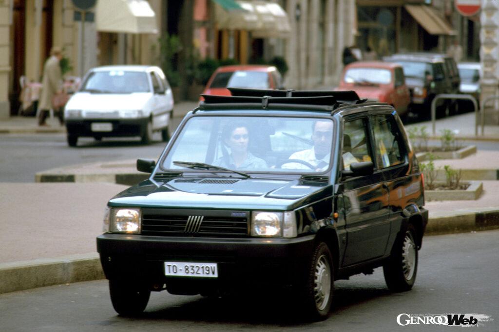
[1] In a 1968 design change, the “500” emblem was changed to a diagonal diamond. [2] The “five bars” were first used on the 1982 FIAT Panda.
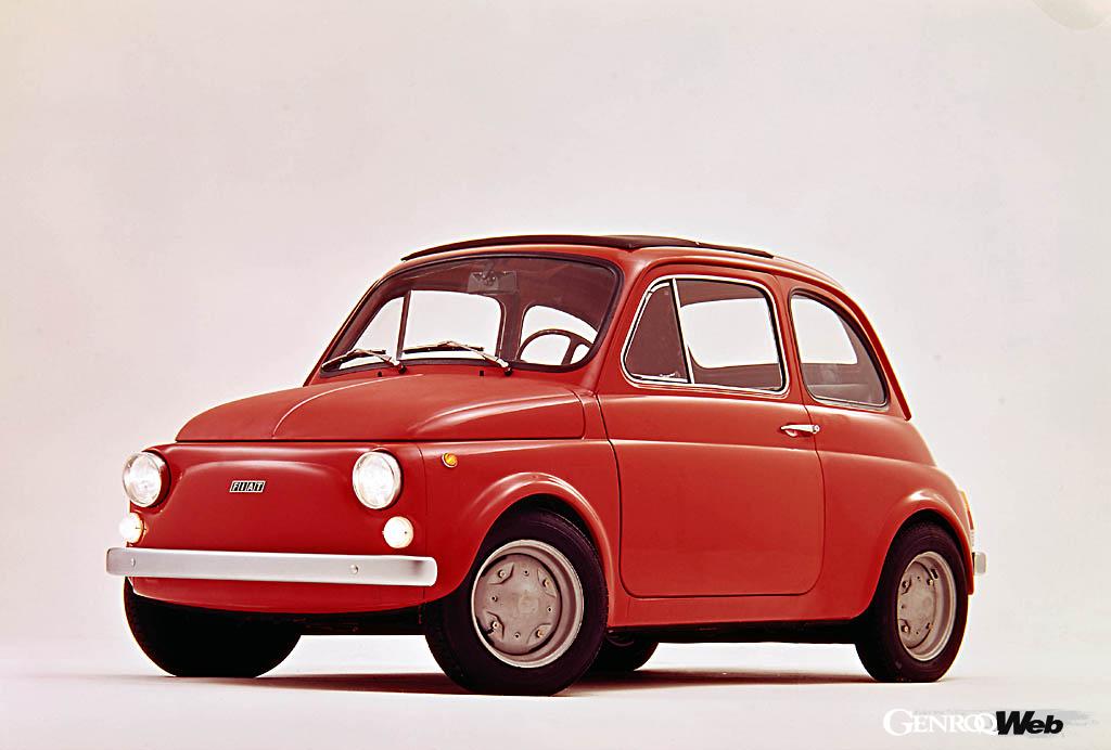
By the 1960s, Fiat had grown into an international conglomerate. In 1968, the company adopted a modern logo: four diamonds, each containing the word FIAT. The silver lettering stood out against a black background, emphasizing the company’s presence in over 150 markets worldwide. This emblem, which remained in use for 30 years, was used alongside the white and blue diagonal “Five Bar” logo, which was introduced in 1982.
Return to tradition and the 100th anniversary logo (1999-2000s)
[3]

[4]
[3] The emblem, which was introduced to commemorate the company’s 100th anniversary, incorporated elements of its legacy. [4] In 2006, the emblem was redesigned to incorporate more modern elements while incorporating FIAT’s history.
In 1999, to mark the company’s 100th anniversary, a commemorative logo was introduced, reviving the laurel wreath and the classic “A.” The circular logo was designed with a chrome three-dimensional border.
The group-wide corporate renewal that followed in the early 2000s affected all of its brands, and in 2006 Fiat unveiled a new emblem. Following the same philosophy as the other brands, it incorporated iconic design elements from the past. While retaining its circular shape, the laurel wreath was replaced with a shiny, three-dimensional chrome border, resulting in a simple, eye-catching design.
The rectangular logo used for 30 years since 1931 has been reappeared within the ring with a slight curve, and the red background has been darkened. The vertical letters are now in a modern font, and the distinctive “curved A” has been retained.
Minimalist design symbolizing the EV era (2020 onwards)

[5]

[6]
[5] The current emblem was introduced in 2020. Its minimalist design, in line with the times, makes a strong impact. [6] The compact EV Topolino is a car that symbolizes the direction of the Fiat Group.
In 2020, Fiat unveiled a simplified logo symbolizing a new era of urban mobility and electrification. The logo, stripped of graphic elements and featuring silver lettering, creates a minimalist, modern impression. It made its European debut on the new Tipo and the electric 500e, becoming a new “face” symbolizing sustainability and internationality.
In this way, the Fiat emblem is not merely decorative, but reflects a cross section of Italian industry and culture. For over 100 years, it has embodied Italy’s industrialization, globalization, and return to its roots, and continues to mark its history today.
PHOTO/STELLANTIS