![Lotus’ Legacy Continues: “Why Did British Green Disappear?” [Automobile Emblem Secrets 06: Lotus]](https://wheelfeed.com/wp-content/uploads/2025/03/2119-1761194145076.jpg)
Colin Chapman’s Philosophy

[1]

[2]
[1] The current Lotus emblem has been in use since 2022. [2] In Japan, the Lotus Europa was popular in the manga “Circuit Wolf.”
The emblem features four overlapping letters in the center. These are the four letters “A.C.B.C.”, which are the initials of the company’s founder, Anthony Colin Bruce Chapman. This represents the fact that Chapman’s philosophy has been passed down in Lotus car manufacturing since the company was founded in 1948.
Chapman is known for saying, “Adding power makes you faster on the straights, subtracting weight makes you faster everywhere.”
These initials and the word LOTUS are arranged inside a rounded rice ball shape. Although there are no official records, it is generally believed that this shape symbolizes the lotus flower. The traditional lotus emblem is surrounded by a yellow circle (or oval in some eras) that makes the rice ball shape stand out. One theory is that the yellow color, which is still used today, conveys messages of energy and prosperity.
A turbulent fate and the evolution of the emblem
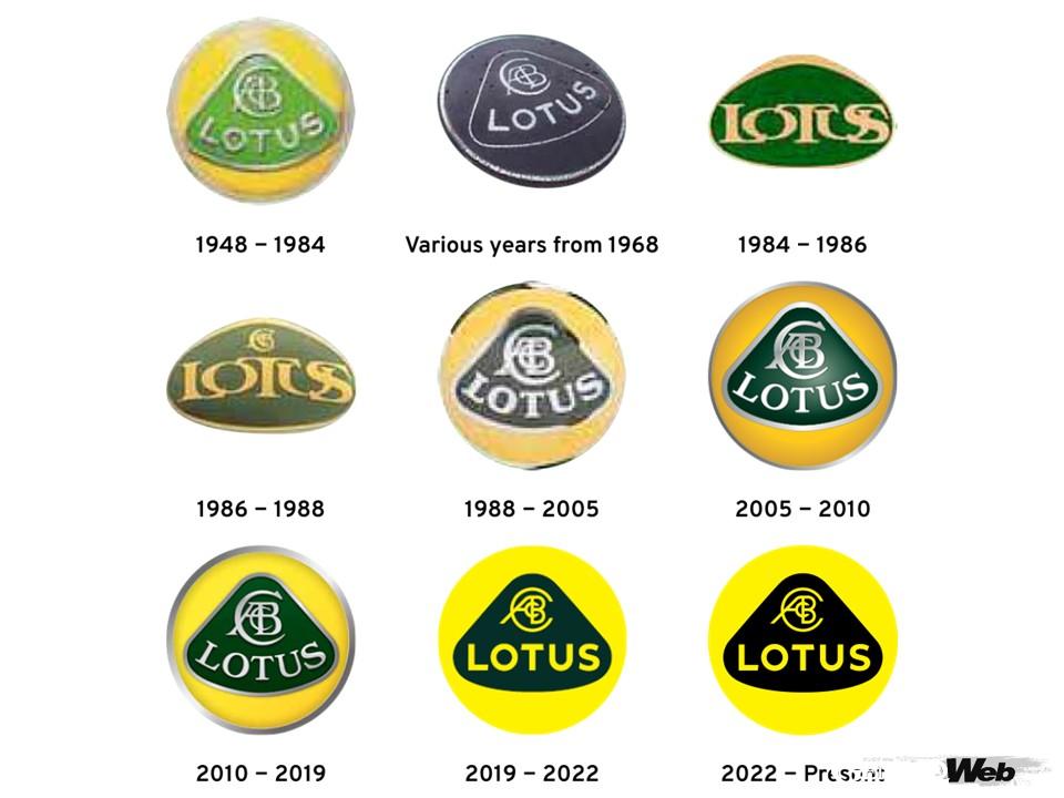
The basic structure of the Lotus emblem has remained unchanged except for a short period of time.
The basic structure of the Lotus emblem has remained unchanged, but there was one time when it underwent a major change. In December 1982, Chapman, the company’s founder and innovative engineer, died suddenly of a heart attack at the age of 54. The death of this charismatic leader made the company’s financial difficulties apparent, and businessman David Wickens took over management of Lotus.
After Wickens took over management, Chapman’s initials disappeared from the emblem for a time. At this time, the rice ball shape, another distinctive feature, also disappeared, and the entire emblem was changed to an oval shape. When the company’s shares were sold to General Motors (GM) in 1986, the letters “A.C.B.C.” were reinstated. Soon after, the overall image returned to the Chapman era.
During this period, GM actively used Lotus in the development and brand promotion of cars such as the Chevrolet Corvette. At the time, Isuzu of Japan was also producing passenger cars under GM. Some readers may remember that in 1988, Lotus tuned the suspension of Isuzu’s Piazza to create the Piazza XE Handling by Lotus.
This is my personal opinion, but GM probably revived the image of the Chapman era in order to maximize not only Lotus’ technology but also its brand value. On the other hand, Wickens, with his pride as an entrepreneur, probably wanted to erase the strong image of his founder from the brand he had acquired. In any case, it seems that GM’s decision was the right one from a corporate perspective.
Towards modern 2D design
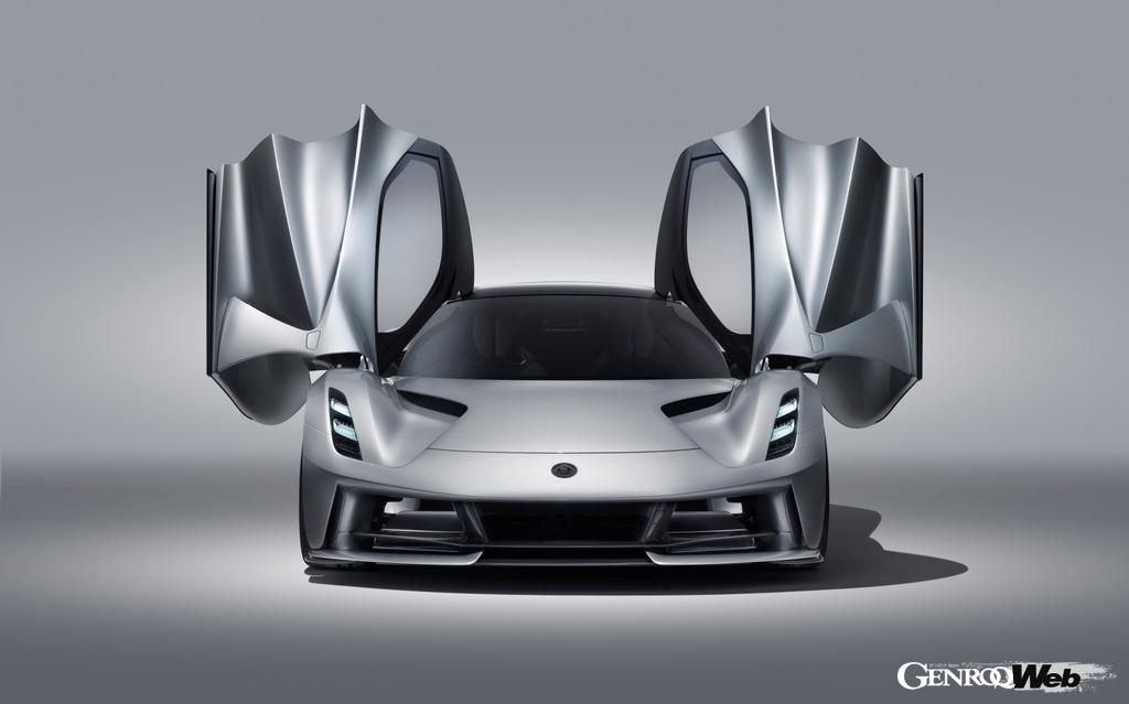
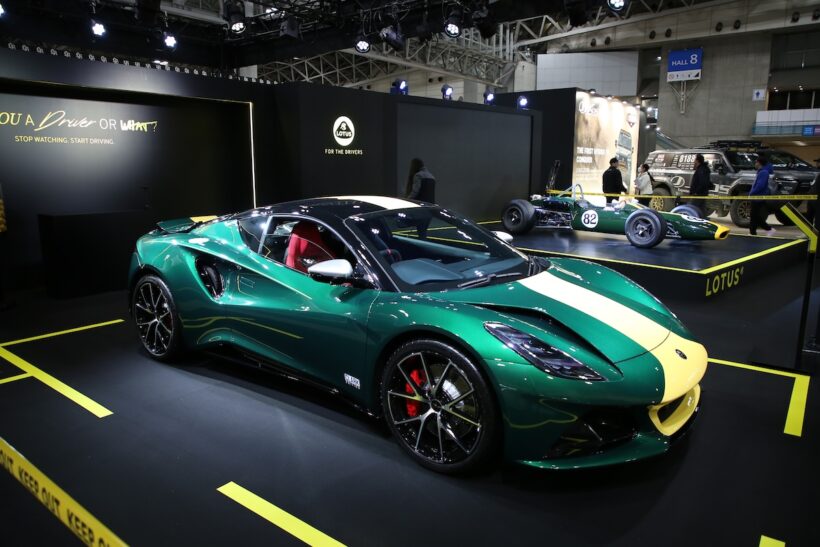
The Lotus Evija was released under the Geely umbrella.
In 2017, Lotus became a subsidiary of China’s Geely Holding Group (Geely Automobile). When the company announced its first EV, the Evija, in 2019, the emblem was also changed. The components and colors remain the same, but Chapman’s initials and the word “LOTUS” have been changed to a simpler font. The overall image has also changed from the previous three-dimensional design to a flatter expression.
The trend towards 2D logos is global, with many brand logos being changed to two-dimensional designs, including BMW and its subsidiaries MINI, Volkswagen, and Nissan. This is because they are easier to recognize on small screens such as smartphones than designs that use shadows and gradients to create a three-dimensional effect. This seems to be an evolution that adapts to the changing times while still preserving Lotus’ identity.
Breaking away from “British Green” and heading out into the world?
The emblem design has been slightly revised to suit the times, but Chapman’s legacy seems to remain.
However, one tradition from the Chapman era has been lost. The British Racing Green color, which remained the same even after the “A.C.B.C” letters were removed, will be changed to black from 2022. For motorsport fans, the Lotus name is also well known in racing scenes such as F1. In the 1960s, the company won the World Championship with the legendary genius driver Jim Clark. In the late 1970s, it invented the ground effect car* and dominated the F1 world at the time.
Chapman’s car manufacturing began with the development of motorsport vehicles, and the company has also been active in the 24 Hours of Le Mans and the Indy 500. The emblem has always been British Racing Green in addition to yellow. This was changed to black in 2022 and remains the same to this day. Compared to the green, it gives a more refined and compact impression, but some fans may find it a little sad considering Lotus’ legacy.
However, the rice ball shape (which is said to be based on a lotus motif) and the initials “Anthony Colin Bruce Chapman” convey his intention to maintain his philosophy on car manufacturing. If we consider this to be a sign of Lotus’ evolution into a global company that is not bound by the idea of ”green = Britain,” then it seems like a reasonable change in the emblem.
*Also known as a wing car or venturi car, this structure generates downforce by utilizing the air flowing under the vehicle.
PHOTO/Lotus Cars