Renault’s 100-year-old “diamond”

[1]

[2]
[1] The diamond emblem first appeared on the Type MN sedan (pictured is the 1926 Renault 40 CV Type MN). [2] The diamond-shaped emblem has a long history and tradition, having been around for over 100 years since its introduction in 1924.
Renault’s origins date back to Renault Frères, founded in 1989 by brothers Louis, Marcel, and Fernand Renault. In 1905, when horse-drawn carriages were still widely used, the company successfully developed the first taxi, the Renault AG 1, and was active in motorsports. During World War I, the company was commissioned by the government to manufacture ambulances, aircraft engines, and artillery shells.
The first emblem was a decorative design of the company’s initials, “R” and “F.” After that, it was changed to a circular design, and then the diamond-shaped emblem that Renault calls the “diamond logo” was introduced in 1924. It was “attached to the hood of the most high-performance model (40 horsepower)” of the Renault “Type NM” sedan at the time. It has undergone nine changes over the years, but the basic “diamond shape” has remained unchanged for 100 years.
Although no official information was available, the Renault diamond is said to symbolize the direction the brand aims for, such as strength, modernity, versatility, reliability, creativity, and refinement. There is also a theory that it represents the pride that Renault has in being a “jewel-like presence” in the automotive industry.
New design coming in 2021
[3]

[4]
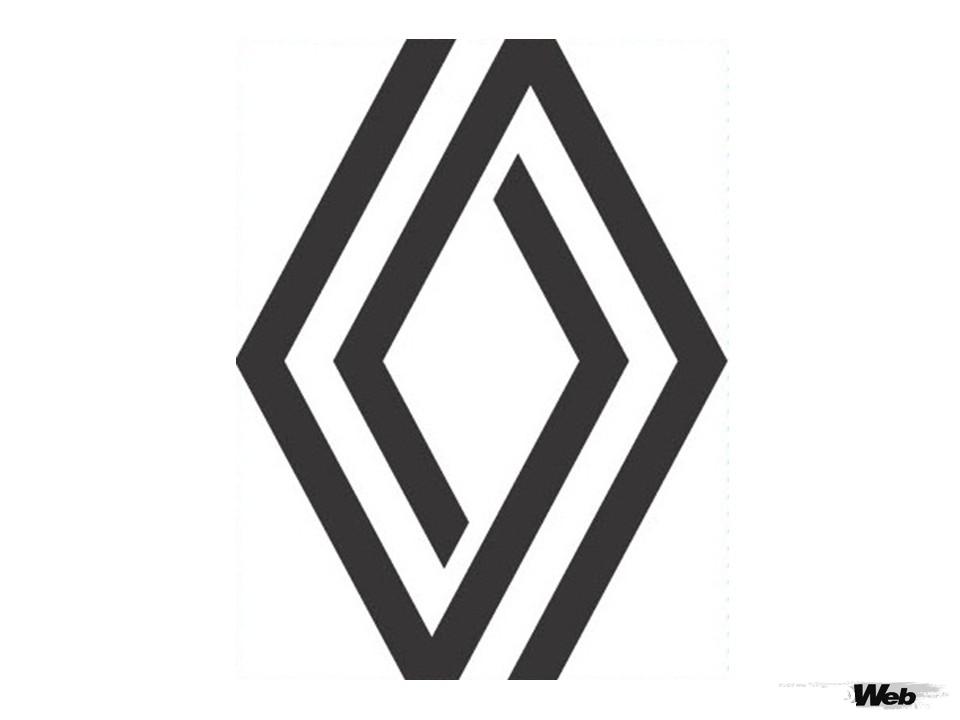
[3] The current emblem was refined in 2021. It will no longer be installed on all vehicles by 2024. [4] The latest model, the Clio (known as the Lutecia in Japan), also features the new emblem.
This diamond underwent its ninth correction and took on its current form in 2021. Renault announced a business strategy called “Renaulution” (a combination of Renault and revolution). The new emblem was attached to the prototype of the “Renault 5” unveiled at the event announcing this four-year plan.
Renault claims that it has since expanded its use of the logo in a “modest yet effective” way, starting with an advertising campaign for the compact EV “ZOE” and gradually expanding its use on social media etc. The logo will be installed on new cars from 2022, and all models will have completed the change to the new logo by 2024.
A design that corresponds to the times

[5]

[6]
[5] The Renault Diamond has been a symbol of Renault for over 100 years, with repeated refinements. [6] The eighth-generation emblem, which has been in use since 2015, featured a three-dimensional design (image captured from the Group Renault official video: “A RENAULUTION FOR THE DIAMOND”).
Gilles Vidal, Renault’s design director, who oversaw the redesign of the emblem, said:
“The (Renault) diamond is one of the most recognizable shapes, not just in the automotive industry but all over the world. It’s a simple geometric shape, but it has a strong identity.”
Renault’s emblem, which Vidal says is “instantly recognizable,” has been updated since 1992, in 2004, 2007, and 2015. However, Vidal said, “The latest version was becoming outdated,” and a modern logo was created with “a balance between the brand’s tradition and its entry into a new era, as a symbol for the future.” The redesign was made with the aim of “leading our brand into the future by adding new values that suit the times” to the traditional and impactful diamond.
Another aim was to respond to the diversification of fields of expression, such as the advancement of digitalization. As we introduced in the previous Lotus article , the trend in logo design has changed from the previous three-dimensional, shaded designs to 2D expressions, and the Renault emblem has also changed to a minimalist design.
A society that respects diversity

[7]

[8]
[7] A photograph of a Renault dealership on the Champs-Élysées in Paris, taken around 1910. This was before the invention of the diamond. [8] The new Espace, due to debut as an EV this summer, will naturally feature the latest emblem.
While maintaining the diamond’s timeless geometric shape, Widdel explains, “we have modernized the lines that are an integral part of Renault’s graphic heritage, without excessive effects or colours, resulting in a simple, symbolic and meaningful emblem that is timeless.” He adds that in the latest logo, “the two intersecting lines form a diamond, which speaks to symbiosis, circulation, mutual complementarity and their continuous development.”
Diamonds have been reborn in a modern style in harmony with the times, and it can be said that they embody the new era that modern society has entered.
PHOTO/Renault Group

![What is the story behind the nine changes to the Renault diamond emblem in 100 years? [Automobile Emblem Secrets 07: Renault]](https://wheelfeed.com/wp-content/uploads/2025/04/2025-1761192808771.jpg)

