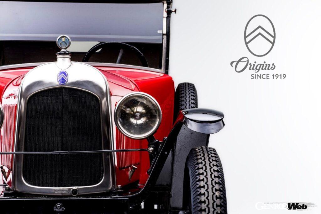
![The History of the Citroën Logo | What is the Meaning of the “Double Chevron”? [Car Emblem Secrets 09: Citroën]](https://wheelfeed.com/wp-content/uploads/2025/05/1837-1761190093608.jpg)

The origins lie in the wooden gears seen in Poland
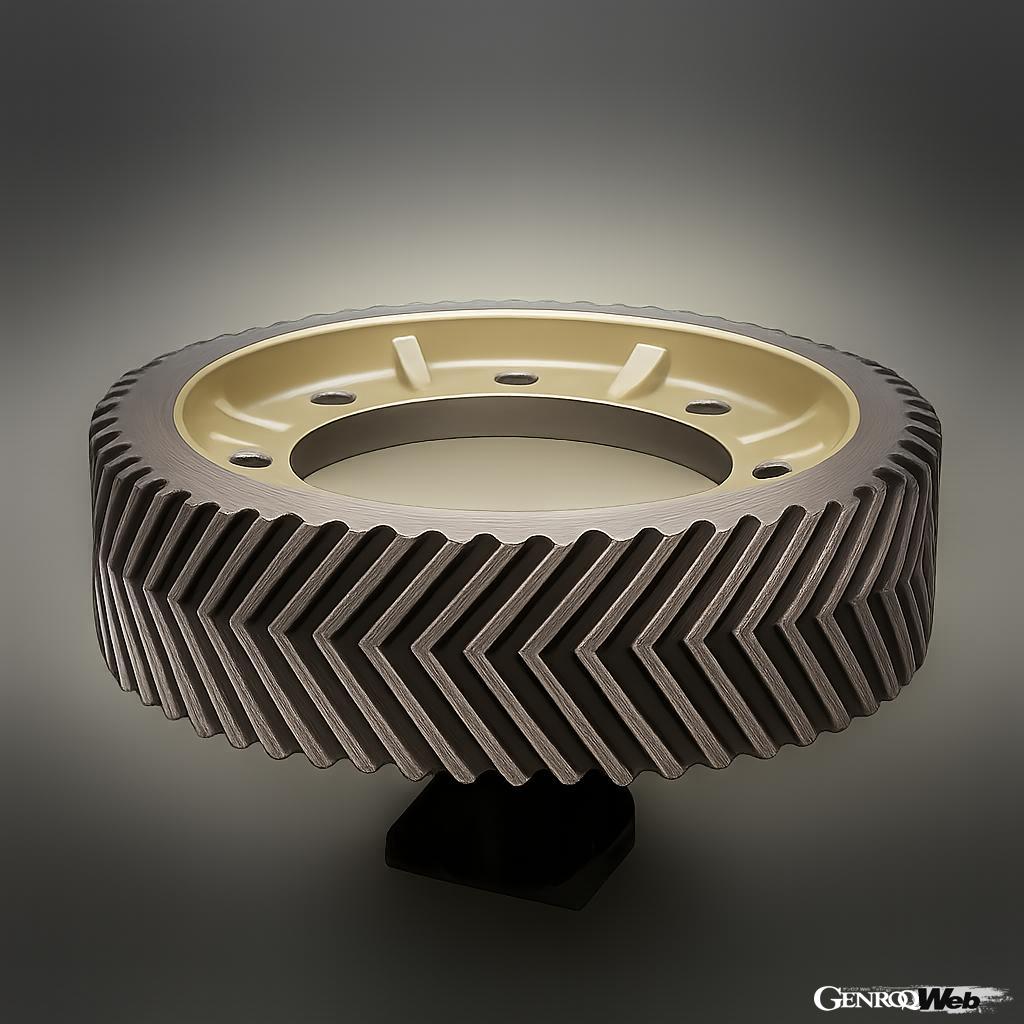
Double helical gear (image)
The Citroën logo is a “Double Chevron” consisting of two inverted Vs stacked one on top of the other. Its origins date back to industrial flour mills. When founder André Citroën visited Poland in 1900, he noticed that flour mills used wooden gears with V-shaped gears. Citroën bought the patent for this structure and developed the industrial “Double Helical Gear.” This enabled highly efficient, smooth, and quiet power transmission, leading to the success of the company’s business. “Chevron” is French for inverted V or mountain shape.
The double helical gear that is the origin of Citroën
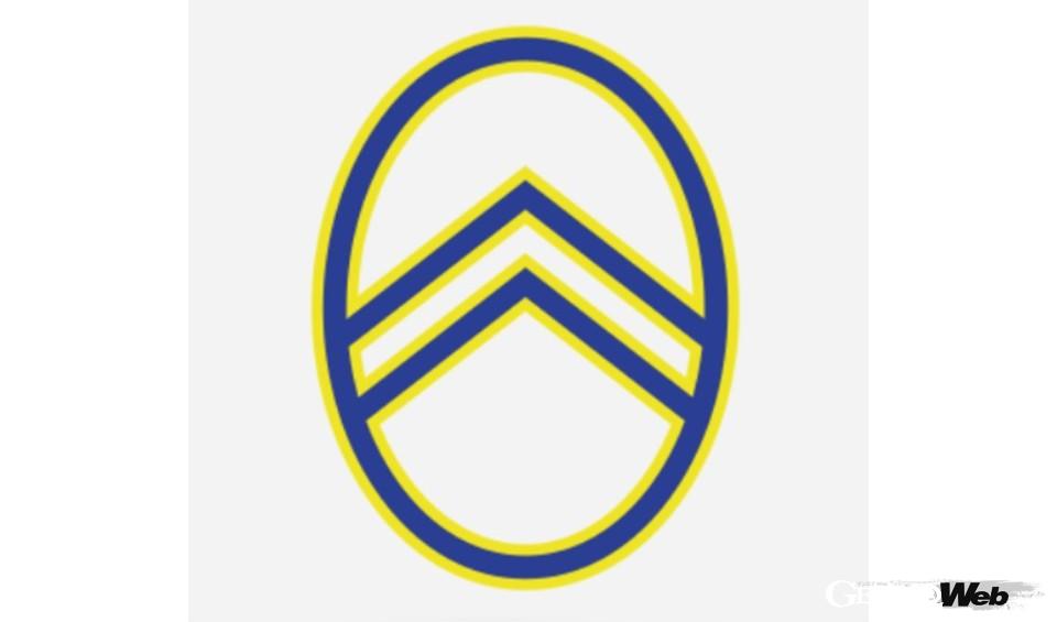
Over 100 years ago, the first corporate logo was already based on the double chevron motif.
Building on the success of this business, Citroën began manufacturing automobiles in 1919. The company logo, a double chevron with a double helical gear motif, was born, symbolizing technological innovation. Although it has undergone changes over the years, the double chevron has remained a symbol of the Citroën brand for over 100 years. The original double chevron was surrounded by a blue oval with a yellow border.
Double Chevron Emblem
The first Citroën, which appeared in 1919, featured an octagonal emblem based on the company logo.
The Citroën 10 HP Type A, equipped with a 10 horsepower engine, was launched with an emblem based on this logo. Citroën’s first car was a model that focused on reasonable pricing and low maintenance costs. It is said that the design and production methods were inspired by the Ford Model T. The car featured an octagonal emblem with a yellow oval, double chevrons, and the word “CITROEN” engraved on a blue background.
“Floating Engine” has a swan badge
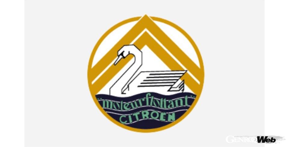
The Rosalie, which boasts a “Floating Engine,” features a swan emblem.
The Citroën Rosalie, which debuted at the 1932 Paris Motor Show, also featured an emblem of a swan floating in front of a chevron. This model used a vibration-damping structure that used rubber bushings in the engine mounting area. Citroën called it a “floating engine” to emphasize that engine vibrations were not transmitted to the cabin. This swan emblem was attached to the Rosalie until 1935.
Company logo and car emblem

[1]

[2]

[3]
[4]
[5]
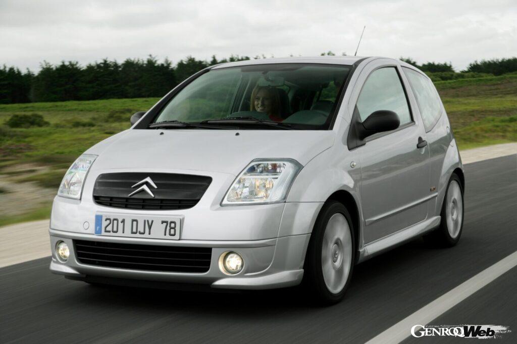
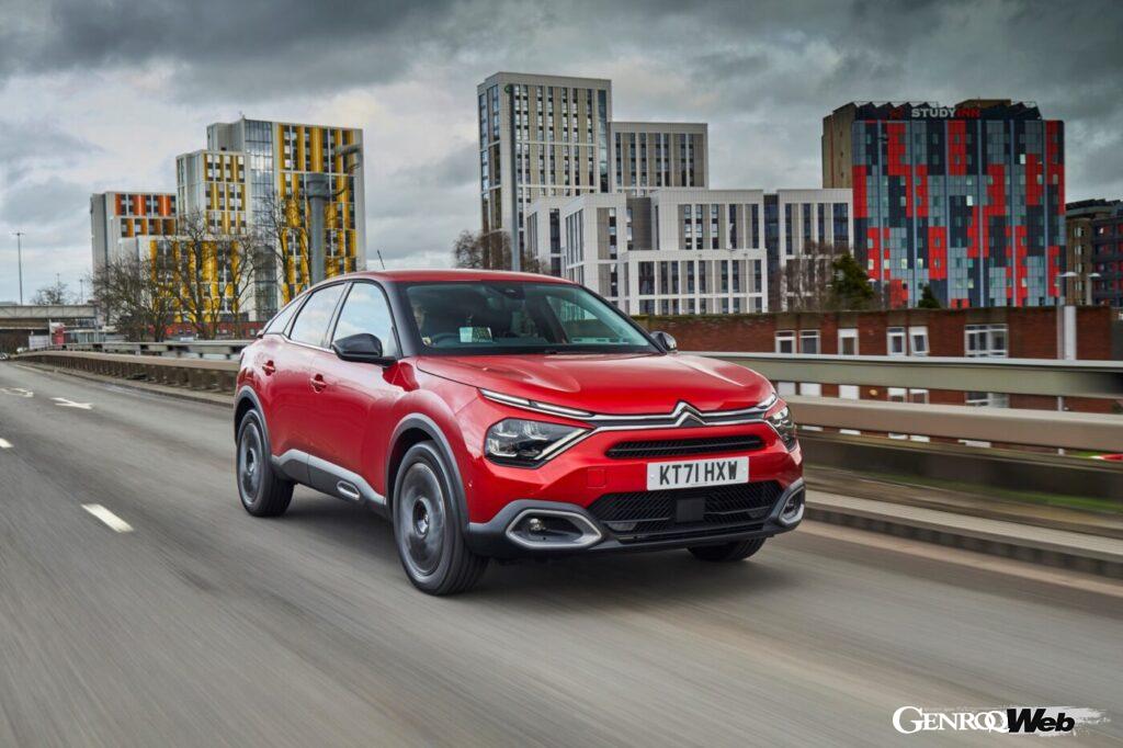
[1] The Traction model has no badge and features a large double chevron on the front grille. [2] The BX model, which appeared in 1985, has a double chevron on the left edge of the front end of the hood. [3] The Saxo (debuted in 1996) has the emblem in a conventional location. [4] The C2 (2005-present) also has a double chevron in the center of the grille. [5] The C4 (2020-present) uses a helical gear design as the element connecting the front end of the hood and both headlights.
In the case of automobile brands, it is not uncommon for the company logo to not necessarily be the same as the emblem attached to the car. For example, there are examples of older Ford models that do not have the so-called “Ford oval.” Citroën is also a case in point. For example, the “Traction,” released in 1934, has neither an octagonal emblem nor a swan badge.
Instead, a large double chevron design can be seen on the front grille. Given the positioning and design of this model, it is thought that the company chose to use only the chevron emblem, which is a symbolic icon, rather than a decorative corporate logo.
Since then, the design has continued to be refined, with the placement and size of the double chevrons being adjusted to suit each model. In recent years, many readers may have been impressed by designs that have integrated the double chevrons into the tip of the hood, etc. This shows that at Citroën, the emblem was treated as an element that made up the overall design of the car.
Changes in corporate logos to suit the times

[6]

[7]
[6] This is an old emblem that is thought to have influenced the current Citroën logo. [7] The current emblem, while using double chevrons, seems to symbolize both modern values and traditional Citroën attitude.
While the double chevron emblem has always been used on cars, the company logo has been updated five times since 1959, every 10 to 20 years, before being changed to its current design in 2022. The double chevron, which is wider and more assertive than before, is surrounded by a “soft vertical oval” (according to Citroën), creating a contrasting effect. Future models will likely be fitted with an emblem with the same design as this logo.
The design is reminiscent of the emblem attached to radiators in the 1950s, as Citroën says it has “returned to the origins of the brand.” At the same time, it has been redefined to suit the times, reflecting its determination to “transform and evolve the Citroën brand to move towards a responsible future.” Citroën, which began with the invention of the double helical gear, can be said to be a brand conscious of technological innovation, such as the “hydropneumatic suspension” of the 1950s. What the double chevron has conveyed for over 100 years is Citroën’s spirit of transformation and evolution.
PHOTO/STELLANTIS, Toru Ishikawa