
ASTON MARTIN
Early logos – a simpler era featuring the founder’s name
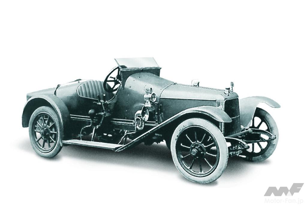
The Coal Scuttle was created by Aston Martin in 1914.
The origins of Aston Martin date back to 1913, when Lionel Martin and Robert Bamford founded Bamford & Martin in London. The brand name comes from the Aston Clinton hill climb race in which Martin competed. The original emblem was an extremely simple monogram combining the initials “A” and “M.”
The Birth of Wings: The Great Turning Point of 1927

[1]
[2]
[1] The original emblem, consisting of two overlapping letters, “A” and “M.” [2] The Aston Martin logo has evolved from a simple A and M to the winged “ASTON MARTIN” logo, and finally to the familiar wing shape.
A major turning point came in 1927. From the end of World War I through the 1930s, airplanes were seen as symbols of the future, adventure, and innovation. Against the backdrop of the booming aviation industry and a desire for speed, automobile manufacturers began to adopt designs featuring wing motifs.
Aston Martin superimposed wings as a symbol of soaring speed onto its brand. Initially, ASTON MARTIN was designed in a winged shape, but in 1932 it evolved into the current feathered emblem. It was around the same time that Bentley adopted the “Winged B.”
007’s beloved DB5: a symbol of British luxury

[3]

[4]
[3] The first James Bond to drive a DB5 was Sean Connery in the film “007.” The DB5 also appeared in films starring Pierce Brosnan and Daniel Craig. [4] The original emblem also featured David Brown’s name.
In 1947, businessman David Brown bought Aston Martin, and the DB series, bearing his initials, was born. The emblem was also refined, and a clean black and white design was introduced. This emblem exuded a classic and elegant presence, and graced the hoods of the DB4 and DB6. In particular, the DB5 driven by James Bond in the film “Goldfinger” made Aston Martin’s wings known around the world as the symbol of “the ultimate sports car chosen by British gentlemen.”
Modern Emblems: The Evolution of Simplicity and Luxury

[5]

[6]
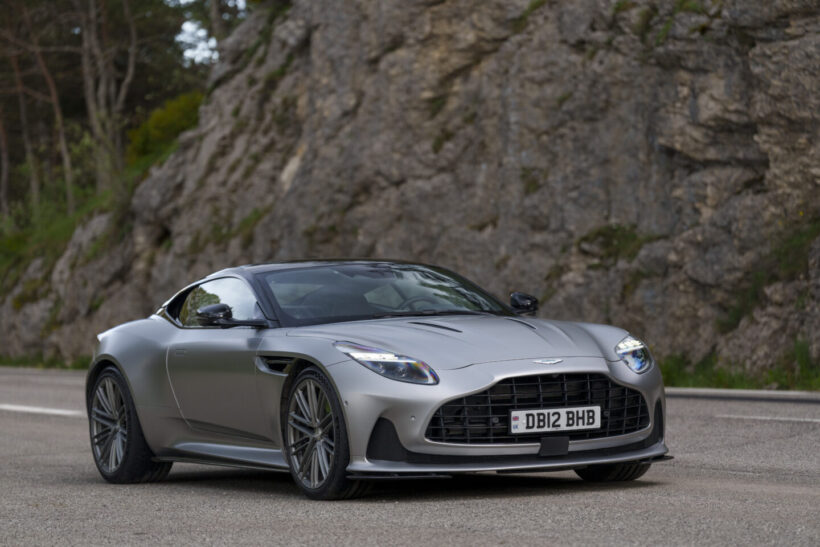
[5] The current DB12 emblem is a modern refinement of the Aston Martin tradition. [6] Even today, Aston still has a strong image of being a “British gentleman’s sports car.”
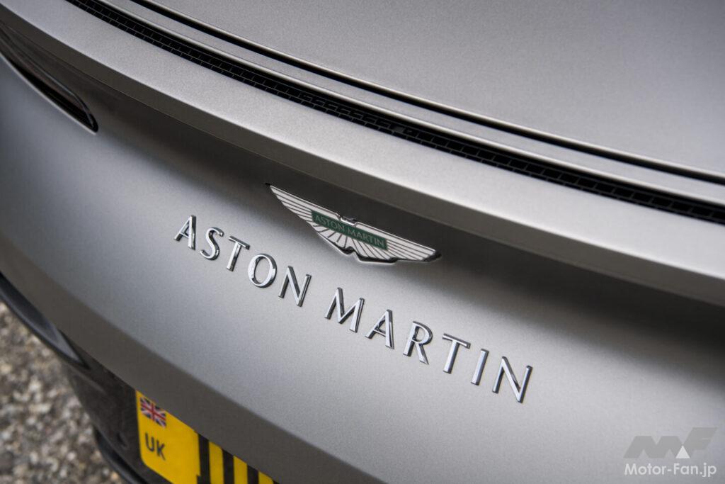
Since the 2000s, Aston Martin has refined its logo with each restructuring and new model launch. While the wing motif remains unchanged, the details have become sharper, evolving into a sophisticated, modern impression. In 2022, designer Peter Saville refined the logo, creating a minimalist design free of unnecessary decoration and improving visibility on digital media. It is characterized by its ability to incorporate modern trends while retaining a sense of luxury and dignity.
Comparison with other British luxury brands

[7]
[8]
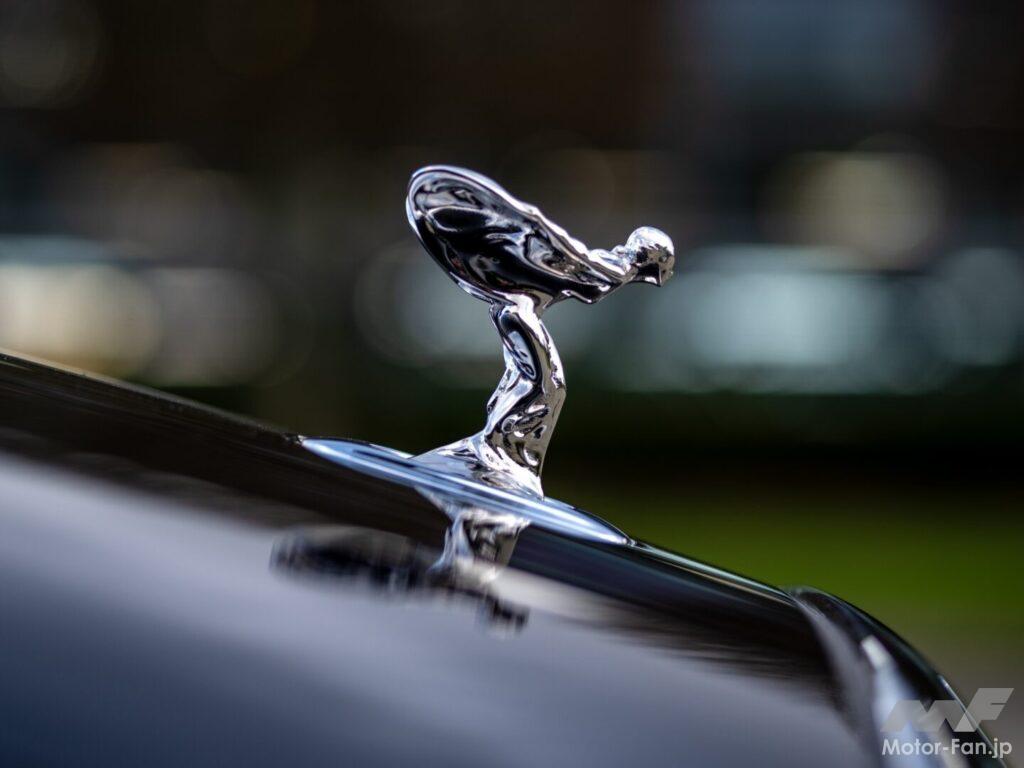
[7] Bentley’s “Winged B” exudes a sense of power. [8] The mascot that adorns the hood of Rolls-Royce is the graceful female figure, the “Spirit of Ecstasy.”
The uniqueness of Aston Martin’s wings is further accentuated by comparing them with the emblems of fellow British brands like Bentley and Rolls-Royce. Bentley’s “Winged B” is sporty yet powerful, symbolizing the dignity of a grand tourer. On the other hand, Aston Martin’s wings give a more light and nimble impression. Its precise lines and sharp shapes are a design that strongly evokes a desire for speed.
Rolls-Royce’s “Spirit of Ecstasy” is a three-dimensional figure of a woman, symbolizing elegance. It stands in stark contrast to Aston Martin’s dynamic wings. It is interesting to note that, despite being both British brands, each company embodies a different philosophy.
The Future of Emblems
The winged emblem will continue to be an icon representing Aston Martin’s philosophy of “combining ultimate performance and emotion.”
The Aston Martin emblem has evolved from the simple monogram of the company’s founding days to the introduction of wings in 1927, its symbolism in the DB series, and its sophisticated modern design. European media outlets say it represents “speed, freedom, and a spirit of challenge.”
As the automotive industry continues to move towards electrification, the company is accelerating the development of its next-generation models. Even in an era where sustainability is emphasized, Aston Martin’s wings will continue to uphold its spirit of “challenge and flight.” The winged emblem not only expresses pride as a British luxury sports car, but also reflects Aston Martin’s determination to continue challenging the future.